
I was embarrassingly late to the ‘Barbie’ bandwagon. In 2023 everybody seemed to be doing the “Barbenheimer” challenge, but I resented the idea of paying to see a film that would inevitably end up on a streaming service, so I waited patiently. A year and a bit later, I can finally say I saw the Barbie movie without paying for a cinema ticket – and it made me think about something I’d been working on.
I won’t spoil it for anyone, but in `Barbie`, Margot Robbie is given a choice. She can choose the glamorous high heel shoe and go back to her old lifestyle, or she can choose the less glitzy but undeniably more comfortable and practical Birkenstocks – wherein doing so, she must embark on a quest to resolve the existential threat facing Barbie Land.
What has this got to do with dashboards, you ask? Well, a request to redesign one of our most popular tools made me question everything I knew about what makes a ‘good’ dashboard. It also made me realise the endless possibilities and choices an Analyst faces when challenged with creating an accessible dashboard (hence the existential threat to Barbie Analytics Land).
The Essex Area Profiles dashboard is an Open Data product which provides summary statistics for each of the Essex districts covering lots of topics from population numbers to emissions data and, in our latest version, social cohesion measures. Its purpose is to enable users to access key insights in one central place, eliminating the need for users to search for multiple open access data sources. By integrating various data sources ‘behind the scenes’, the dashboard saves the user from downloading and manipulating large data files in Excel to get the same information. .
Like most of our Open Data products, the Essex Area Profiles dashboard serves a diverse audience, all of whom may use the product for different purposes. The premise of the dashboard is for everyone to access the local insights they require quickly and easily, whether they’re an Essex County Council employee, an Essex resident, or a journalist looking to publish a story in the press. We presumed that due to its popularity, the product was functioning as it should, and apart from a few live connections going awry ‘behind the scenes’, everything was accessible and relevant to its users.
However, whilst the product’s design was undeniably sleek and glamorous, it was not so accessible or functional as we’d first presumed. This became clear when we were contacted by colleagues from the Levelling Up team, who were using the Essex Area Profiles to inform part of their strategic planning. Levelling Up in Essex means creating opportunities for everyone to enable them to succeed in life. The Levelling Up team brings together strategists, evaluation and research colleagues, the comms team and cabinet member staff, to mobilise programmes and interventions across priority places and cohorts to improve the lives of Essex residents. Because of this, a place-based product such as the Essex Area Profile dashboard was an important tool and source of evidence for their work. Here's what the Levelling Up team said about the importance of having an accessible dashboard: “We recognise that traditional data sets are often presented by service area or topic, and users may not be used to accessing or analysing data at a place level. It was really important therefore that the final product was accessible and simple to navigate in order to ensure it is used widely.”
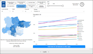
It soon became clear to us that some aesthetic features of the dashboard were confusing for its users. For example, the original design included a line graph which displayed time series data for the twelve Essex districts. While line graphs are helpful for visualising time series information, they aren't a practical choice for dashboards which display multiple variables, since many lines on a single graph can easily become confusing. Users searching for a combined Essex total also found themselves having to add up each of the twelve district totals to get a singular ‘total’ figure – a time consuming and potentially erroneous task. Additionally, users with screen readers found it difficult to use the line graphs, as they required visual interactions to view data labels. Switching to a table and using call-out cards for quick snapshots, like a combined 'Essex total', was a more accessible and practical design choice - even though it wasn't obvious to us at first.
As data analysts, we may overlook this aspect without input from end users.
PowerBI presents us with a blank canvas and lots of different visualisation tools, from simple bar charts to interactive maps and Sankey plots (Sankey plot is a flow chart that uses arrows to shows how things move from one place to another, the width of the arrows show how much is being transferred). With so many options, it’s easy to see how we can end up swayed by the alluring glamour of complex visualisation features – and in the process overlook the fundamentals of effective communicative design (i.e. does this visualisation provide our end user with the sort of insights they need?).
The process of redesigning the dashboard was not so straightforward because it challenged everything myself and my fellow analyst, Vasista Devarakonda, understood about ‘good’ dashboard design. This challenge is exacerbated when working with a predominantly visual tool, such as PowerBI, where users rely on visual features to access the information they need. Philosophers refer to this challenge as ‘Myopia’, which occurs when a group of people with a specific point of view (i.e. data analysts) subconsciously replicate their viewpoint through their practices (i.e. designing dashboards). This can lead to overlooking aspects that seem obvious to those outside the group; hence, shortsightedness (‘myopia’) ensues.
Philosophical and existential conundrums aside, overcoming some of our assumptions about what constitutes a ‘good’ dashboard required a collaborative approach. This started with rephrasing the problem. Instead of asking our colleagues from the Levelling Up team to list everything they disliked about the area profiles product, we started by reviewing examples of dashboards they found helpful. This enabled us to identify features that enhanced general accessibility, such as:
- Keep it simple! Reduce the amount of information in a single visualisation. With 12 districts to cover, the temptation was to plot all the information at once – but having at least 12 datapoints, across multiple variables, quickly leads to confusing visualisations.
- Don’t underestimate the importance of highlights – it’s what most users want to see. Summary visualisation tools, like call out cards and gauges, can supplement your charts and graphs by giving users quick access to the headlines.
- Provide users with interactive features and enable them to manipulate the data themselves, rather than overloading pages with excessive content. This included tools such as filter buttons, drop down boxes for selecting variables to explore, and date slicers for time series data.
- Make sure that accessibility features for visually impaired users are enabled. Features such as alt text, setting up an underlying tab order (so that items on a page appear chronologically), and clearly labelling navigation buttons, can help to support users with visual impairment and screen readers to navigate a dashboard more easily.
Once we identified some key features, we then assessed the overall content of the area profiles. When working through all the different datasets, it was helpful to continuously ask ourselves questions such as “is this relevant to anyone?” and “is the level of detail appropriate here, especially for colleagues who might want to use this tool as part of their strategic planning?” Reflecting on our content choices in this way helped us to identify and replace irrelevant and outdated information with timely and relevant insights. This process led us to create some new sections and features, which you can check out here. Following on from our review of the previous Essex Area Profiles, the Levelling Up team highlighted the importance of maintaining an accessible dashboard in their feedback: “The Essex Area Profiles are a great start to ensuring we have joined up place level data, and something we hope to continue to develop as more data becomes available and our understanding of how people are using it grows.”
Did all of this give Birkenstocks, as opposed to glitzy and glamorous high heeled shoes? Perhaps. But like Barbie, we approached the existential threat challenge with curiosity and learned valuable lessons about ourselves along the way.