How do we measure the health of a place? And how does that compare to other places? How is the health of these places changing over time?
I’m sure like me, you are often kept awake at night wondering these things…but I’m here to put your mind at rest! The Essex Health Index Dashboard holds the answers to all these questions and allows you to explore the data (at any time of night or day) to find out much more.
What is the Health Index?
For those of you not familiar with it, the Health Index is a product created by the wonderful people at ONS. They have taken a whole bunch of health related indicators and used various weightings to cleverly roll them all up into a single value known as the Health Index.
This can be used to compare different geographies (including local authority, ICS, regions and national level) and to look at how this changes over time…even more exciting is that this can be broken down into the component areas and the factors that influence these changes.
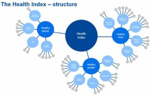
The Health Index is made up of three broad areas known as domains:
- Healthy People - covers health outcomes which is things like life expectancy, physical health conditions like dementia, cancer and kidney disease, disability, personal wellbeing, and mental health.
- Healthy Lives - covers health-related behaviours and personal circumstances including obesity, hypertension, drug misuse, smoking and cancer screening.
- Healthy Places – covers the wider social, economic and environmental drivers of health such as crime, unemployment, child poverty, pollution, noise and road traffic.
Tell me more! I hear you cry. Well, OK since you ask…
- Underneath each domain are the 14 sub domains, then 56 indicators and then a whopping 71 indicator components. So there really is a lot of work behind making the index look so simple.
What do the scores mean?
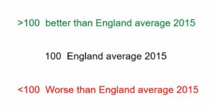
It’s really easy to understand the index, you just need to remember the golden rule:
The Health Index score has a baseline of 100, which represents England’s health in 2015. Every score is relative to this position.
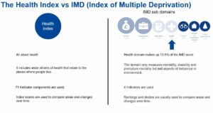
Isn't this a bit like the Index of Multiple Deprivation and the Health Domain?
Well yes, and no.
Both use indicators to assess the health of an area but that’s where the similarities end.
The IMD Health domain only uses 4 indicators and these measure morbidity, disability and premature mortality but not aspects of behaviour or environment. Whereas the Health Index uses 71 indicator components (that never stops being impressive does it?) looking at a wide range of health data and takes into account wider drivers of health that relate to the places where people live.
The IMD is ranked from best to worst and relative positions are used to track changes over time. Contrastingly, the Health Index is a score that can be used to assess real movement against the baseline and make meaningful comparisons between geographies and points in time.
So, in a nutshell the Health Index wins hands down.
About the dashboard
The data has been available publicly for a while (no, I didn’t know either), but I wanted to make this accessible to everyone, tailored to our Greater Essex geographies and fully interactive so you can enjoy digging around in the data if that’s the kind of thing you like.
My vision is that the index will be used as a catalyst to start conversations among decision makers here at ECC, partners and also the public, further driving transparency and accountability.
So, whether you’re a commissioner looking to find out what physical activity looks like across Essex or an analyst seeking some insight around wellbeing trends, the dashboard will help you find what you’re after.
Benefits:
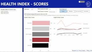
- Customise your view to compare local areas and hierarchical larger geographies.
- Scores can be viewed at various levels from the overall Health Index, through the domains, sub domains and down to indicator level.
- Indicator components and associated metadata can be viewed easily.
- Scores at all levels can be viewed for any selected single geography for the latest year to give a snapshot of current position.
Before you rush off to start using this amazing new tool, it’s important to know that the index scores have a lag of around a year,at the time of writing the latest data is 2021 (the amount of work collecting the data and processing it to produce the Health Index does take time). That’s not to say that this isn’t a great place to start exploring and joining up this insight with other datasets specific to your areas of interest to complete the picture.
The dashboard can be found on the Essex Open Data platform either via the search or directly with this link:
https://data.essex.gov.uk/dataset/24q18/health-index-dashboard
Please do drop us some feedback on the blog – have you found the dashboard interesting, was there something you didn’t know about your area, or has it been a useful tool for decision making? I’d love to know how it’s being used and who by
Leave a comment