In the first installment of this two-part blog post, we looked at a popular plotting package in the R programming language; ggplot2. We saw how this package can be used to build plots by layering data and geometric objects, and how this package allows us to map many aesthetics of the plot to our data and customise these to our specific needs, via three key concepts. In this post, we will examine two further concepts to explore how we can apply the final 'polish' to our plot, and by using some of the many extension packages available for ggplot2, we can elevate our plot to tell the story of our data.
Concept 4 - Fine tuning with theme settings
Whilst we might spend some time customising the data elements of our plot like the colours and shapes of points or other geoms, we may also wish to customise the non-data elements of our plot such as the axes, plot area, and text. The best way to do this is by changing our theme and theme settings. Changing the theme makes wholesale changes to the plot, whilst changing the theme settings enables us to make fine-scale changes.
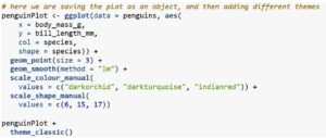
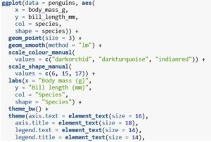
For scientific publications, my 'go to' theme is often theme_bw() which creates a nice clean look. However, some further tweaking is still required. For example, I find the text on the axes to be too small, along with the legend text, and I don't like the gridlines. To make these changes, we can adjust a few of the many arguments within the theme() function. A glance at the myriad of arguments that can be adjusted in the this function (?theme) gives you a picture of just how much can be adjusted if you choose to do so.
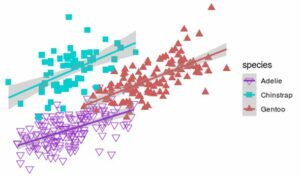
Note that here I've adjusted the axis labels as well, to give an idea of how 'polished' this graphic can look. Also, giving colour and shape the same label prevents two separate legends being created for colour and point shapes when only one is needed.
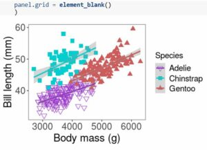
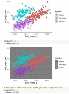
Looking good - we've gone from a very basic plot to something that would fit well within a scientific journal article by simply adding layers to our plot.
Concept 5 - Extending ggplot2's capabilities
In most cases, ggplot2 offers enough customisation and functionality. However, there are times when we need a more specialist type of plot, or a specific modification to a plot - this is where the vast array of extension packages to ggplot2 come in. There are an ever increasing number of packages to extend ggplot's functionality, and a few I've found quite useful are: * ggforce - excellent for creating interesting zoomed plots, or for adding shapes to a plot. * ggrepel - allows you to label individual data points in such a way that they repel each other to avoid overlapping text. * ggmap - does what it says on the tin and allows you to plot many kinds of spatial data formats within the ggplot framework. * gganimate - again, does as it says by allowing you to animate aspects of your plot and create gif files, great for time-series datasets! * ggiraph - if you work with networks in R then this is by far the best package I've used for plotting them! * An item
In particular, I want to highlight my favourite ggplot extension package, which is the patchwork package. This package makes it easy to create very neat and aesthetically pleasing panel plots by arranging multiple plots next to each other via an intuitive syntax. These panel plots are great when you have a series of plots that, together, tell a story about the data.
Let's look at a simple example where we compare the first plot we created in this post to the finished product, so we can see what a difference all those small customisations make.
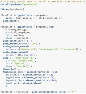
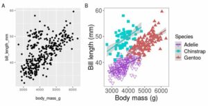
There are several things to note here. Firstly, we were able to generate automatic plot tags by adding the plot_annotation() function and setting tag levels to start at 'A'. Secondly, we can see that the plots have been perfectly aligned - the plot areas line up perfectly as do the axis labels and text. So much neater than doing it yourself in powerpoint!
Summary
There we have it - this was by no means a comprehensive tour of the plotting possibilities offered by ggplot2, but hopefully it does give you a taster of what can be done with a little work. We saw how by starting off with the most basic of plots and simply adding layers to it, we were able to end up with a highly polished attractive data visualisation that would be suitable for publication. In the age of 'fake news', making accurate, attractive, and informative plots is essential in bridging the gap between people and data - so give ggplot2 a go and I guarantee you won't look back!